Projects


View Projects

SMMRY-XT

Quickly summarize articles on the web

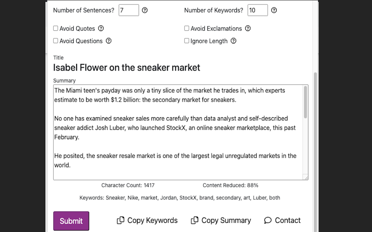
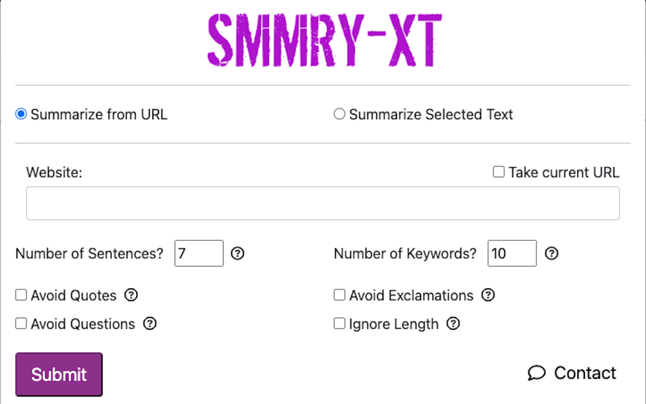
SMMRY-XT is a Chrome and Firefox extension that helps users save time by quickly summarizing fluff-filled web articles where substance can be reduced to a few key pieces of the article. People who value their time but want the key information can use SMMRY-XT to cut down their time and effort to extract the same content. Features include:

  • (NEW) Summarize selected text.
  • Quick copying of the current URL.
  • Setting length of summary and number of keywords returned.
  • Filtering sentences containing quotes, exclamations, or questions.
  • Copying the summary to the clipboard.
  • Copying the top keywords.
  • This extension does not track any information about you, previous summaries, or browsing history.

Upcoming based on user requests:

  • Introduce right-click menu option on any link or selected text for summarization.
Note: This extension is not the official SMMRY extension and is not endorsed by SMMRY.

Duclade

Built for writers and readers.

Every story has a plot, every guide has a goal, almost every problem has multiple ways to be solved. What do all of these have in common? Two things: 1) Each one has an overarching idea. 2) Each one has multiple sequential "steps" that when put together prop up the overarching idea.

In Duclade, 1) is a "content" and 2) is a "subcontent". A content has information like a title, hook, category, tags, etc. It can be thought of as the entire book, the whole story. Any Duclade user can create a new content if there is a story that they want to share.

A subcontent can be thought of as chapters. Subcontents contain the writing piece (text only for now), summary, and title among other things. But here's the catch: everywhere on the internet and in the world, one person (or group) writes the entire book. End of story (pun intended). But not at Duclade. Here, any user can write their own subcontent that builds off other user's contents and subcontents.

This is where the magic takes place. Say you are reading a story and are eight chapters deep. In the ninth chapter, the main character inexplicably follows through on some horrible act that wasn't in that character's expected plot. You hate it. Other might have liked it and continued down that story, but not you. If this were a book, you'd put it down and never pick it up. But this isn't a book, its on Duclade. So you, as a Duclade user and creative writer, could go back to chapter eight, and write your own version of chapter nine, where the main character does something more heroic than what was in the original story you read. And you can write a 10th chapter which builds off your chapter nine and so on, and it doesn't have to follow the original story at all! You have the freedom to build off what others wrote, and others have the freedom to build off of what you wrote. Other readers might like your version too and they can like and recommend your story to their friends. For a certain content, there may be many different paths readers could go down. They can follow which path works towards the plot or ending they want to see most.

Classifying Poisonous Mushrooms using Decision Trees and Random Forests

Classified 8,000+ mushrooms and compared the two classifiers

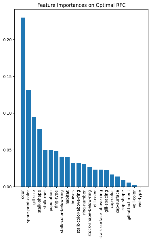
The objective of this project is to use a machine learning technique that we were taught in our class (INF 552) and apply it to a dataset of our choosing. I was interested in Random Forests even though it was not explicitly taught in the course. With the permission of the professor, I used decision trees and random forests to predict which mushrooms are poisonous. On top of that, I also compared the two classifiers using different parameters and limitations to analyze the advantages and disadvantages of each.

The data is sourced from UC Irvine's data repository.


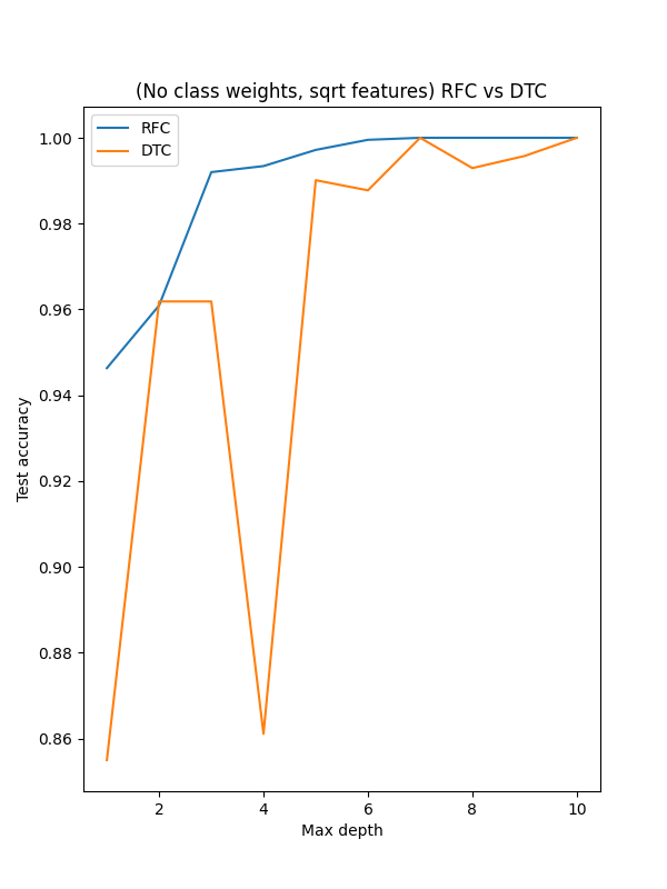
Though both classifiers were able to easily get to 100% accuracy without overfitting, the Random Forest model displays more consistency under suboptimal conditions. Another aspect I implemented was to err on the side of caution: we would rather not eat an edible mushroom instead of eat a mushroom that is poisonous. The models during this testing have this built in using class weights.

For this dataset, the decision trees did not have issues with overfitting, which is usually one of the main drawbacks. But when using other parameters such as using all or only the square root number of features and max depth, one can see how the decision trees are not as consistent. It is worth pointing out (for this dataset) that decision trees are able to achieve perfect results with significantly less computation than random forests.

You can read or download the full paper and code below. This was a solo project.

Reselling Nike Sneakers

StockX's reselling data reveals Nike's hype machinery

One of my hobbies is collecting sneakers. Many of the recent shoe releases have been marketed with limited releases, special editions, and collaborations. Nike leads the pack with a extensive collaboration with Virgil Abloh's OFF-WHITE brand. But because of these releases having limited quantities, secondary markets (StockX, GOAT) has grown immensely over the past few years.

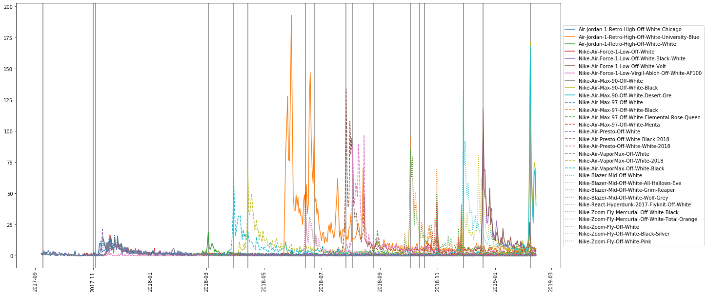
For fun, and to increase my prospect of interning for Nike, I analyzed data that StockX released as part of their data competition. I analyzed the Nike x OFF-WHITE collaboration based on reselling data from late 2017 through early 2019. I explored the data, transformed it, re-framed it to look at each shoe release chronologically (image below), and created a hype decay model.

There were nearly 100,000 records in the dataset, of which approximately 30% were of the Nike collaborations and 70% were of Adidas x Yeezy. I mainly focused on the Nike collaboration. In my analyses, I look at the data chronogically to see if there were any relationships between the shoe releases and the surge in quantities being sold. The vertical lines in the image above are release dates, and the lines are for each model as described by the legend.

Then, I created a model that looked at the decay of the hype as time gets further from the release dates. The notebook details exactly how the model is created: "What I did was I created a model to fit the number of resells after the largest peak. Then, I analyzed after how long it took for the hype to die, based on my model. It seems the data best fits on an logarithm line." The average decay for all sneakers was about 58 days! Which means that from the peak, people would continue selling the shoes for the next two months. Finally, I analyzed the revenue cost that StockX gains from Nike's sneakers and Adidas' sneakers. Even though Nike's sneakers were under 30% of the number of sneakers sold, they produced over 57% of the revenue for StockX!

While I was interviewing for a summer internship, I was able to show this analysis and thought process to my interviewers at Nike. I have accepted an offer from Nike as a Data and Personalization Science Intern for Summer 2020. You can view the notebook below:

Race On Competitions

Built an RC car and developed an self driving algorithm

As a group, we built a small RC-style car (this type of kit) and loaded it with a Raspberry Pi, battery, and a Pi camera. We then developed an algorithm to have the car drive around a track using a Jupyter notebook. Some of that algorithm is below. We competed in a competition to see which car could finish the track the fastest. We finished 10th out of 44 contestants. There will be more races in the Spring 2020 semester. I will update this with pictures of the car, track, and additional code (as well as put it on Github) next semester. [UPDATE: Because of coronavirus, RaceOn competitions were cancelled.]

Relationships between Solar and socioeconomic and/or demographic factors

Analyzed data from Google, 2010 Census, and IRS for non-trivial relationships

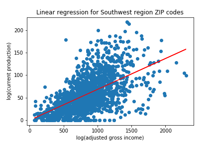
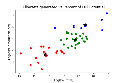
In this project, I downloaded datasets from Google's Project Sunroof for solar, U.S. Government's 2010 Census for demographics, and the IRS for income data. The intent of the analysis was to figure out if there are any relationships between the amount of solar being produced and any socioeconomic and/or demographic factors. The datasets are all linked by U.S. Postal (ZIP) codes.

I assumed that since California is a very liberal state home to wealthy individuals and technologically advanced companies, that it would have more progress on solar. The California government (as well as the Southwest region) offers many incentives to not only individuals but also businesses to invest in solar. Thus, I hypothesized that the solar production and installations in California would be higher than other parts of the nation. Similarly, another hypothesis is that ZIP codes with an average higher income have made further progress on solar than ZIP codes with a lower average income. I used linear regression, a correlation matrix, and k-means clustering as part of the analysis to determine if there are any relationships.

The analysis shows that there was no simple linear relationship between solar production and average adjusted income of that ZIP code. Interestingly, though, the Asian population is moderately correlated to existing installations of solar. There is no evidence that Asian households or Asian owned buildings are the ones investing in solar. It could be due to the fact that there are more Asians in higher cost of living areas such as Los Angeles and the San Francisco Bay Area. Lastly, the results shows that the states that have the most to gain from solar (in terms of potential kilowattage) are indeed the ones that have made the most progress so far.

You can read the full report and see the code below. My responsibilities included collected the data, modelling and storing in SQL database, all analysis code (Jupyter Notebooks), visualizations (Tableau and matplotlib), and writing the full report.

Market Sector Analysis

Python program to analyze top stocks and the sectors to which they belong

This project's ask was to create a program (or a script) to scrape one or two websites and call one or two APIs, model the data collected, and execute a simple analysis or display a visualization. I chose to look at the top 200 symbols by volume traded, group them by their sector, and analyze which sectors performed best over the past 100 business days. You can view a snippet of code below or check out all the details and code on Github!

NBA Statistics Analysis

Year-Over-Year comparison of players and teams league-wide

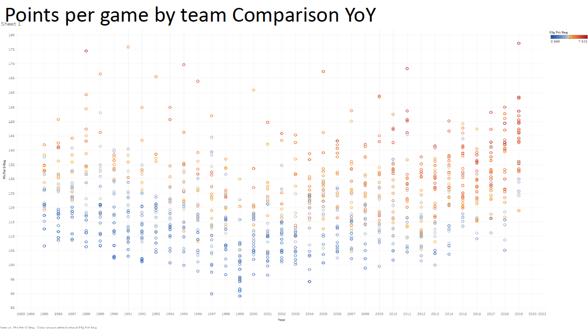
For this project, I collected data from basketball-reference.com using Python and BeautifulSoup, and then put together an analysis of year-over-year (YoY) comparisons of players and teams.

I collected data of every player of every team that played since 1985. Example links look like this: https://www.basketball-reference.com/teams/DAL/2010.html.

To clean the data, I looked through each column, since scraping doesn't provide perfect data and it might not have been consistent. Initially, I had data from 1980, but the data was very similarly structured for years past 1985, so I removed all the years before that. Moreover, to remove unnecessary noise and outliers, I discarded all players who played less than 10 games that season and/or less than 10 minutes per game. Lastly, for any players that had missing columns, I had to shift all the data points down one cell as they filled in one cell early.

The reason behind my analysis is that the past five or so years seemed like there were more and more records being broken and impressive accomplishments being achieved (see the first slide for a handful of recently broken records). I wanted to analyze today's NBA to see if the play is at a higher level than we've seen before (i.e. the Golden Age of NBA Basketball). What I considered the "Golden Age" of basketball would be a high of efficiency, raw output, and improvement across the league.

I looked at various statistics of not only basic numbers such as points, rebounds and assists, but also advanced metrics such as performance ratings, efficiency, and offensive/defensive ratings. I used Jupyter Notebooks and Tableau for analysis and visualizations (like the one below).

In the end, it turns out that we aren't witnessing the Golden Age quite yet. The top 50 players and powerhouse teams are accomplishing a lot but the other "average" players are actually not performing at the highest level. In terms of 3-pointers, efficiency, and for the top 50 players, though, we are witnessing the Golden Age. Lastly, we are actually close to seeing the Golden Age. If the trends continue as they are, we could potentially see record highs in efficiency and scoring. The only thing that needs to improve is the performance of the "middle 200" players to the level of a couple decades back. In conclusion, we are on the brink - so keep watching!

You can take a look at the slide, all the visuals, and poster below.


Contact


Copyright © Atharva Fulay 2023